
A popular request we get is for font sizes to be changed in a web design project. Based on our clients experience with print and graphic design projects it seems reasonable that they may want to adjust something based on how it looks on their screen. But unlike print media a website page will change in size depending on what device they are using at the time. A design for an A4 piece of paper will always look the same on any A4 piece of paper, but the website will need to be viewed effectively on a wide range of screens and devices.
Our aim to to ensure that you can use your website in a big screen presentation in a 3000 seater auditorium and at the same time be used effectively on the smallest phone of phone screens.
The science and application of fonts in design is called Typography, and print and graphic typography has a whole set of different rules than the rules that apply to website typography.
To a certain extent website typography is a little more rigid due to the following factors.
A web browser like Chrome, Microsoft Edge or Mozilla firefox is not a screen that show pictures but rather a program that reads code and decifers what it is saying providing an interactive environment between the user and the site. It can only read code it already understands or has a reference for.
Web fonts are often stored in a website files or on a registry owned by companies like Google. Your website tells the browser what font to use and the browser goes looking for the font. That font has to be online and available somewhere for it to be used otherwise things break
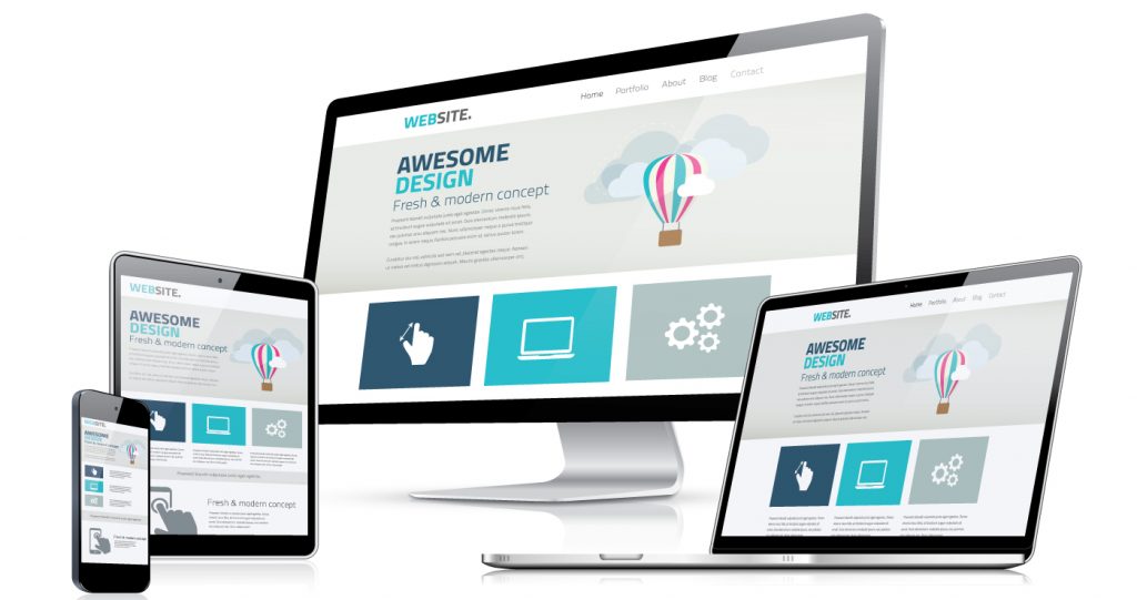
Web design rules break a website into 12 sections; these sections can be broken down for devices that use the full width of your site in 12 sections (as in a desktop screen), 6 sections (as in a tablet using landscape mode), or 3 sections (using a mobile phone). We create font size to adapt your site to fit all of these posabilities.
Ultimately a good website is a user interface, as your designers we will endeavour to ensure your design, layout and fonts work together to deliver the best user experience that helps your visitors find what they need on your site.
Interesting
The screen sizes that visitors will view your site on are quite varied, at the time writing this Apple has 11 differnt screen sizes and Android has 8 Differnt Screen sizes.

Good info
Website logo rules…
Should go in the top left corner
- preferably horizontal to minimise the space it takes up
- on evey page, reminding visitors where they are
- should adapt to the device that you are using it on
Also in the footer
- along with contact details and address
Recent projects

Earle is a Digital Marketing Specialist with over twenty years of experience. Specialising in growing client databases and online memberships, he is the director of Clientology and owner of webticky.com